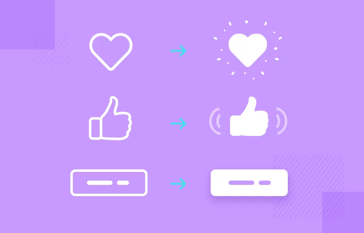
When it comes to designing exceptional user interfaces, every detail matters. While the overall layout and navigation are crucial, it’s the small interactions that can make or break the user experience. Enter “microinteractions,” tiny but impactful design elements that engage users, provide feedback, and enhance the overall usability of a website or app.
What Are Microinteractions?
Microinteractions are subtle, often unnoticed animations or responses that occur when a user interacts with a digital interface. They serve several essential purposes:
- Feedback: Microinteractions confirm that an action has been recognized. For example, a button changing color when clicked provides visual feedback.
- Engagement: They make the user experience more engaging and enjoyable. Think of the satisfying sound when you “like” a post on a social media platform.
- Guidance: Microinteractions guide users through processes. Progress bars or step-by-step animations help users understand where they are in a multi-step task.
- Visual Delight: These small design elements add a touch of delight to the user experience, making it more memorable.

Examples of Microinteractions
Let’s explore a few common examples of microinteractions:
1. Button Press Animation: When a user clicks a button, it might subtly change in color or size to indicate that the click was successful.
2. Loading Spinners: A spinner animation lets users know that content is loading, preventing frustration.
3. Notifications: When a new message or notification arrives, a brief pop-up or sound alert grabs the user’s attention.
4. Hover Effects: When the cursor hovers over a clickable element, it might change color or display additional information.
Why Microinteractions Matter
Microinteractions might seem like minor details, but they play a significant role in enhancing user experiences:
- Usability: They provide clear cues and feedback, reducing user errors and increasing the usability of an interface.
- Engagement: Microinteractions can make an interface feel more dynamic and engaging, encouraging users to explore and interact more.
- Brand Identity: Consistent microinteractions contribute to a unique brand identity and user recognition.
- User Satisfaction: Well-executed microinteractions can delight users and leave a positive impression.
Designing Effective Microinteractions

Creating effective microinteractions requires a balance between functionality and aesthetics:
- Purpose: Start by defining the purpose of the microinteraction. What should it communicate or facilitate?
- Subtlety: Microinteractions should be subtle and not distract from the main content.
- Consistency: Maintain a consistent style and timing for microinteractions across your interface.
- User Testing: Always test microinteractions with real users to ensure they enhance, rather than hinder, the user experience.
In conclusion, microinteractions are the unsung heroes of user interface design. These small, thoughtful details can elevate your website or app, creating a more engaging, user-friendly, and memorable experience. When harnessed effectively, microinteractions can be a powerful tool in your UI/UX design arsenal.
So, as you embark on your next design project, don’t forget to consider the magic of microinteractions and how they can transform your user interfaces.

